Chart element
It is possible to insert these types of charts in the designer:
•A bar chart
•A line chart
•A pie chart
•A scatter chart
To insert a chart you need to click this icon:

You find this icon by clicking the '+' icon to reveal the second row of design elements:
The chart element has these parameters apart from the dimensions and positions (depending on the selected chart type):
Chart type
The type of chart, that you want to insert:
Chart type | Description |
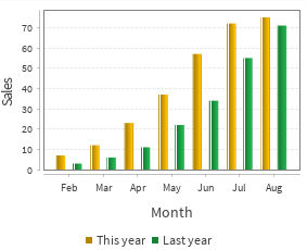
Bar | Each value of the data set is represented as a bar. |
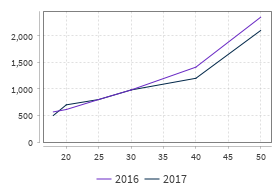
Line | Each value of the data set is represented as point on a connected set of lines. |
Pie | Each value of the data set is represented as a piece of the pie. |
Scatter | Each value of the data set is represented as a dot in the chart. This is similar to a line chart with out connected data sets. |
Data set
In this parameter you need to specify the path in the input XML file to the parent node in which the "collections" node is found. The collections node must be the only child node to the selected parent node and the parent node cannot have any attributes.
(The structure is a bit different for each of the chart types. This example is for a line chart)
<collections>
  <series>
    <color>#6929c4</color>
    <name>2016</name>
    <values>
      <value>
        <x>18</x>
        <y>567</y>
      </value>
      <value>
        <x>20</x>
        <y>612</y>
      </value>
    </values>
  </series>
  <series>
    <color>#012749</color>
    <name>2017</name>
    <values>
      <value>
        <x>18</x>
        <y>500</y>
      </value>
      <value>
        <x>20</x>
        <y>700</y>
      </value>
    </values>
  </series>
<collections/>
The nodes are these:
Node name | Description |
collections | The main container for all data to be used for a chart. In the chart you need to select the parent node of the collections node. |
series | The series subtree contains a single data set, which e.g. will be represented a connected line, a specific color of bars or a piece in a pie chart. |
color | The color used for the line/bar/dot. This must be specified. The color is defined in hex for the Red, Green and Blue components. Use e.g. #000000 to use black. |
name | The name/description of the series/data set. |
values | A container of all values for the actual data set/series |
value | One entry in the data set as an x and y value. |
x | The value for the horizontal axis (unless rotated). This must be an integer. You can use the function, round() to round off the value. |
y | The value for the vertical axis (unless rotated). This must be an integer. You can use the function, round() to round off the value. |
*The data set structure is a bit different for the pie chart has a color node inside each value node.
- X-label
A description for the horizontal axis. This parameter is not an option for the pie chart. - Y-label
A description for the vertical axis. This parameter is not an option for the pie chart. - Show legend
Displays a colored dot and the name for the data set from the input XML file.
Other chart type specific parameters are listed below under the chart type.
The bar chart has these specific parameters:
Show shadow
If enabled this will cause InterFormNG2 to add a shadow (a white line) on the bars. If disabled no shadow (no white line) will be added.
Horizontal bars
Enable this option to rotate the bar chart, so that the bars grow from left to right.
The line chart has no additional parameters apart from what is mentioned above.
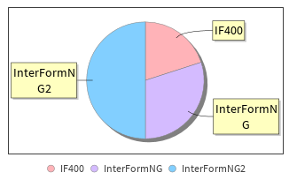
The pie chart has this extra parameter:
Show labels
If enabled each part of the pie chart has a line to the outside with a description (the yellow frames above).
Different data set for pie charts:
The data set structure for a pie chart is a bit different (compared to the other charts) as there is a color node in each values node like below:
<?xml version="1.0"?>
<values>
  <value>
    <color>#ffb3b8</color>
    <x>IF400</x>
    <y>20</y>
  </value>
  <value>
    <color>#d4bbff</color>
    <x>InterFormNG</x>
    <y>30</y>
  </value>
  <value>
    <color>#82cfff</color>
    <x>InterFormNG2</x>
    <y>50</y>
  </value>
</values>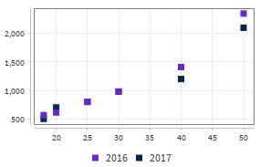
The scatter chart has no additional parameters apart from what is mentioned above.
<xml>
<collections>
  <series>
    <color>#6929c4</color>
    <name>2016</name>
    <values>
      <value>
        <x>18</x>
        <y>567</y>
      </value>
      <value>
        <x>20</x>
        <y>612</y>
      </value>
    </values>
  </series>
  <series>
    <color>#012749</color>
    <name>2017</name>
    <values>
      <value>
        <x>18</x>
        <y>500</y>
      </value>
      <value>
        <x>20</x>
        <y>700</y>
      </value>
    </values>
  </series>
</collections>
</xml>
Related Articles
Comment element
You can use the comment element to document the structure and changes to templates. To insert a comment in your template you need to insert the comment element with this icon: You find this icon by clicking the '+' icon to reveal the second row of ...Select element
In the designer there are two conditional elements: The If element and this, the select element. The select element is an advanced version of the If element, that makes it possible to branch out to different sub-folders with elements, depending on ...If element
It is possible to specify, that some design elements should only be included if a certain condition is met. For that you could use the If element as described below. A more advanced option is to use the select element. You can insert an If element ...Cell element
When you insert a table element in the designer, then each block of the table is referred to in InterformNG2 as a cell. There is no limit the the element types, that you can insert inside a cell; you can even insert a table in a cell. So most of the ...Bookmark element
You can make InterformNG2 add a bookmark element in the output PDF with the Bookmark design element. The element only has an effect on merges into PDF. You can decide, if the bookmarks should be shown when the PDF file is opened and to which level ...